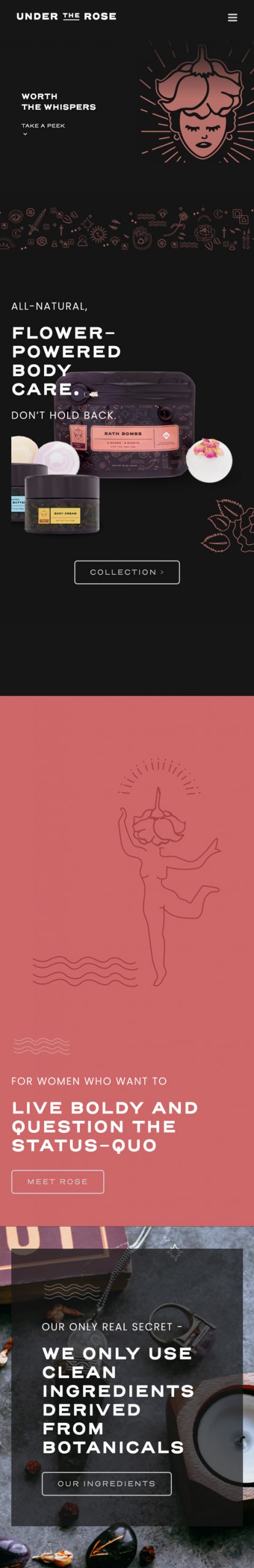
Under the Rose
Brand Design // Packaging // Website // Marketing Materials
This blooming cannabis skin-care company desired an edgy brand that simultaneously embraced femininity.
Brand Logo
![UTR-rgb-white-ONLY-600px](https://stand-creative.com/wp-content/uploads/2021/06/UTR-rgb-white-ONLY-600px.png)
We let our imaginations run away with us as we embodied a rose as a feminine character, inspired by Tarot art.
![under-the-rose-hero](https://stand-creative.com/wp-content/uploads/2021/06/under-the-rose-hero.jpg)
Brand Assets
We created custom line art illustration to envelope the brand in a rich story with themes of Tarot and tattoo art, witchcraft and herbalism.
![UTR-palm-art-600px](https://stand-creative.com/wp-content/uploads/2021/06/UTR-palm-art-600px.jpg)
![UTR-lion-art-600px](https://stand-creative.com/wp-content/uploads/2021/06/UTR-lion-art-600px.jpg)
![UTR-heart-art-600px](https://stand-creative.com/wp-content/uploads/2021/06/UTR-heart-art-600px.jpg)
Packaging
The packaging design incorporates a family of line art with color defining the different products. Certain larger illustration elements are at use to emphasize the individual product: on the body butter, the diving woman to represents hydration, and on the bath bombs, you see steamy a clawfoot tub.
![UTR-body-butter-CMYK-4.26.2021](https://stand-creative.com/wp-content/uploads/2021/06/UTR-body-butter-CMYK-4.26.2021.jpg)
![body-butter-1600px-V2](https://stand-creative.com/wp-content/uploads/2021/06/body-butter-1600px-V2.png)
![UTR-body-cream-CMYK-PRINT-4.22.2021](https://stand-creative.com/wp-content/uploads/2021/06/UTR-body-cream-CMYK-PRINT-4.22.2021.jpg)
![body-cream-1600px-V2](https://stand-creative.com/wp-content/uploads/2021/06/body-cream-1600px-V2.png)
![UTR-bath-bomb-CMYK-PRINT-4.8.21](https://stand-creative.com/wp-content/uploads/2021/06/UTR-bath-bomb-CMYK-PRINT-4.8.21.jpg)
![bombs-isolated-1600px-V3](https://stand-creative.com/wp-content/uploads/2021/06/bombs-isolated-1600px-V3.jpg)
Website
Just as we were asked to do with the logo design, we created a new, 30-page website that breathed more youthful life into the brand, inspiring a renewed interest for classical music.
![browser-under-the-rose-1600px](https://stand-creative.com/wp-content/uploads/2021/06/browser-under-the-rose-1600px.jpg)
The artful layouts are not sacrificed on mobile.
to scroll
![](https://stand-creative.com/wp-content/uploads/2021/06/UTR-mobile-500px-scaled.jpg)